BrandHub portal
Kelly Services marketing resources portal

Overview
BrandHub is an internal branding site for Kelly Services where marketers and branch managers can find things like logos, brand guidelines, photos, and marketing collateral. The previous platform that housed marketing materials was cumbersome and unattractive. We switched to a different platform that would support more design options and have more features.
My Role
My main role was to ideate and create visuals for the redesign of the branding site. I also consulted on UI best practices and helped with the build. The creative direction was to unify the brands and have fun with it. One of the reasons I enjoyed this particular project was that I had some flexibility with the brand guidelines.
Process
First thing I had to do was figure out how to make the site look cohesive while juggling six different branding guidelines. Each business unit has their own section that functions as a mini site that is customized to their needs. Using the overall Kelly branding throughout the site wouldn’t be optimal because there would be thumbnail photos of brand-specific collateral that wouldn’t make sense with the overall Kelly look. The solution was to create an overall BrandHub aesthetic and work in the BU branding.
Research
My research started with exploring the new platform to see available design options and limitations. I then looked for inspiration from sites such as Behance, Dribble, Awwwards, and some client’s examples provided by the platform owners.
Imagery
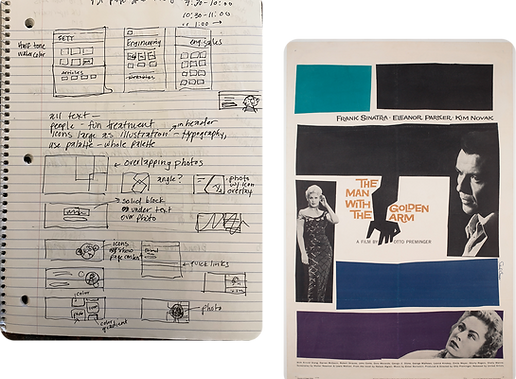
With the flexibility of the guidelines on the table I could have some fun with the visuals. I did some loose sketches and notes to better help me think about layout and a visual theme. I wanted to try some vector illustration options so I went to Shutterstock to find a few different styles and ideas. If I was using a particular artist’s pieces I wanted to make sure they had enough content variety to encompass Kelly’s different products. I needed subject matter from education to light industrial to engineering, and many more. I made mood boards encompassing the different illustration styles.
I did four styles of homepage and secondary page header mockups. After presenting the concepts, the look that was ultimately chosen was a merging of geometric shapes and photography. For that concept I kept thinking about Saul Bass and how he used black and white photos with colorful shapes.
Changes
With the concept chosen, my partners wanted a couple adjustments. They wanted the people photos in color (with the exception of International, that is their look) and they wanted the geometric shape I originally had behind the cutout people to be reminiscent of a “B” for “BrandHub”.

Build
Now that I had my template it was time to assemble the visuals for the business units. I found photos and merged them with the geometric illustrations for the headers and thumbnails making sure to utilize each BU’s color palette. I placed the images on the site and helped adjust the pages.

Final designs

Impact
So now, with one click, everyone could get to the BU-specific materials they needed. They had a platform that was much more intuitive, easier to navigate, and looked much better. After an adjustment period, more and more collateral was being downloaded. As a bonus, my Creative Director let me know that the company representative for the platform was so impressed that he asked to use it as an example to show other clients. This project was a HUGE undertaking and I had fun being a part of it.